AI Assisted Infographic Design
Canadian Sphagnum Peat Moss Association (CSPMA)
The Canadian Sphagnum Peat Moss Association reached to design a series of infographics for them to communicate complex agricultural and environmental data clearly and visually. The main emphasis of this project was integrating AI into the design workflow, from early ideation all the way through diagrams, images, and icon generation. This helped to move faster and spend more creative energy on refinement rather than starting from scratch.
This case study showcase the process for only one of the infographics.
Project duration
May 2026 - Ongoing
My role
Freelance Graphic Designer
Tools used

Figma

ChatGPT

Gemini
The Brief
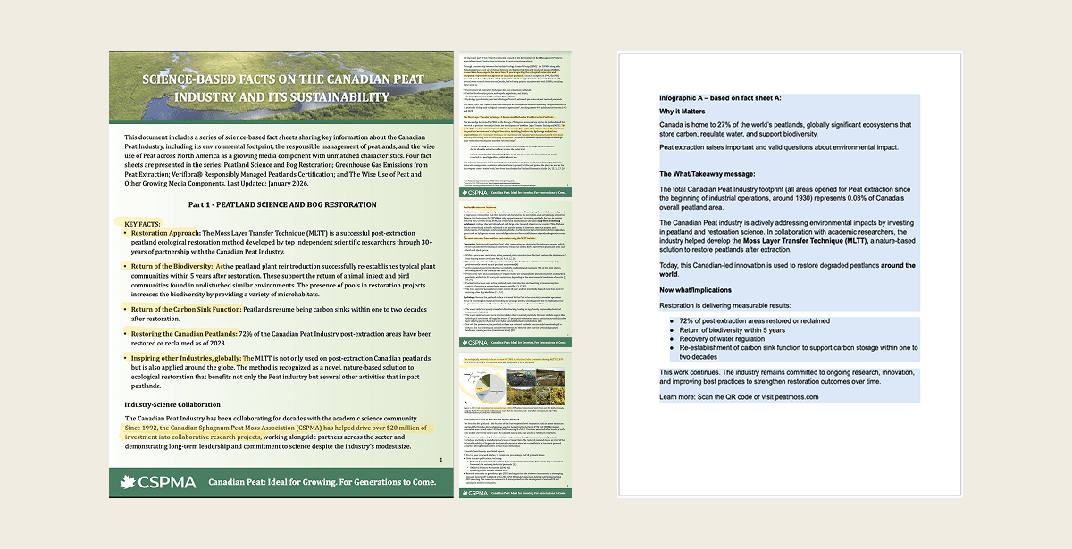
The association came with a clear goal: turn dense fact sheets into accessible, visually engaging infographics. We connected through Google Meet to align on the briefs, available resources, timelines, and content priorities. To set up the project for success, I requested a condensed reference doc pulling only the key information that must appear on the infographic.
AI-Powered Ideation
With both the full fact sheets and the condensed key-info doc in hand, I fed them into AI to rapidly generate initial visuals of key information. Rather than spending hours sketching rough layouts, this gave me a fast, informed starting point.
The goal wasn't to use the AI output as a final design, but to compress the ideation phase and go into design with a clearer sense of direction.
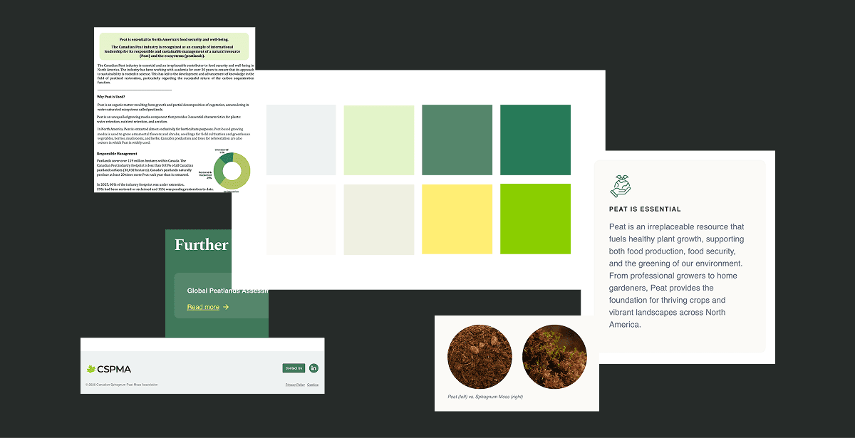
Reading the Brand
CSPMA didn't have a brand guidelines document in place, so the only direction they provided upfront was the typeface they wanted to use. To work responsibly within their identity, I researched how the brand was being expressed across their website, observing their colour usage, visual tone, and layout sensibilities.
Designing the Infographics
I finally moved into the design with the AI-generated concept as a guide for structure, hierarchy, and content placement, cross-checking throughout against the fact sheet and key info document to make sure nothing was lost or misrepresented.
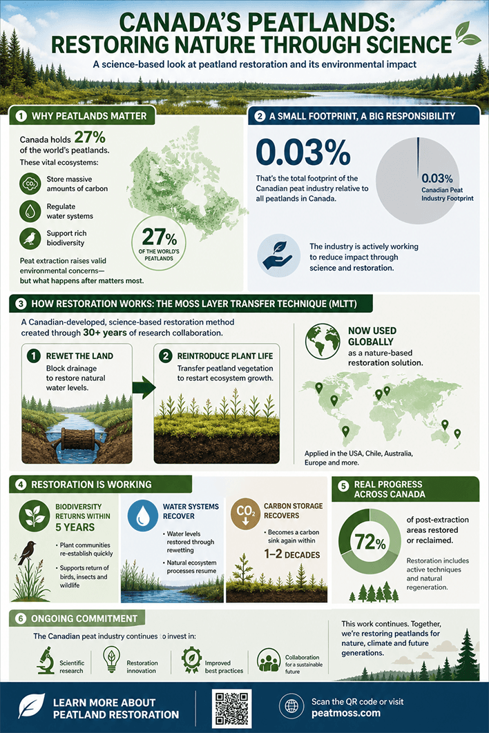
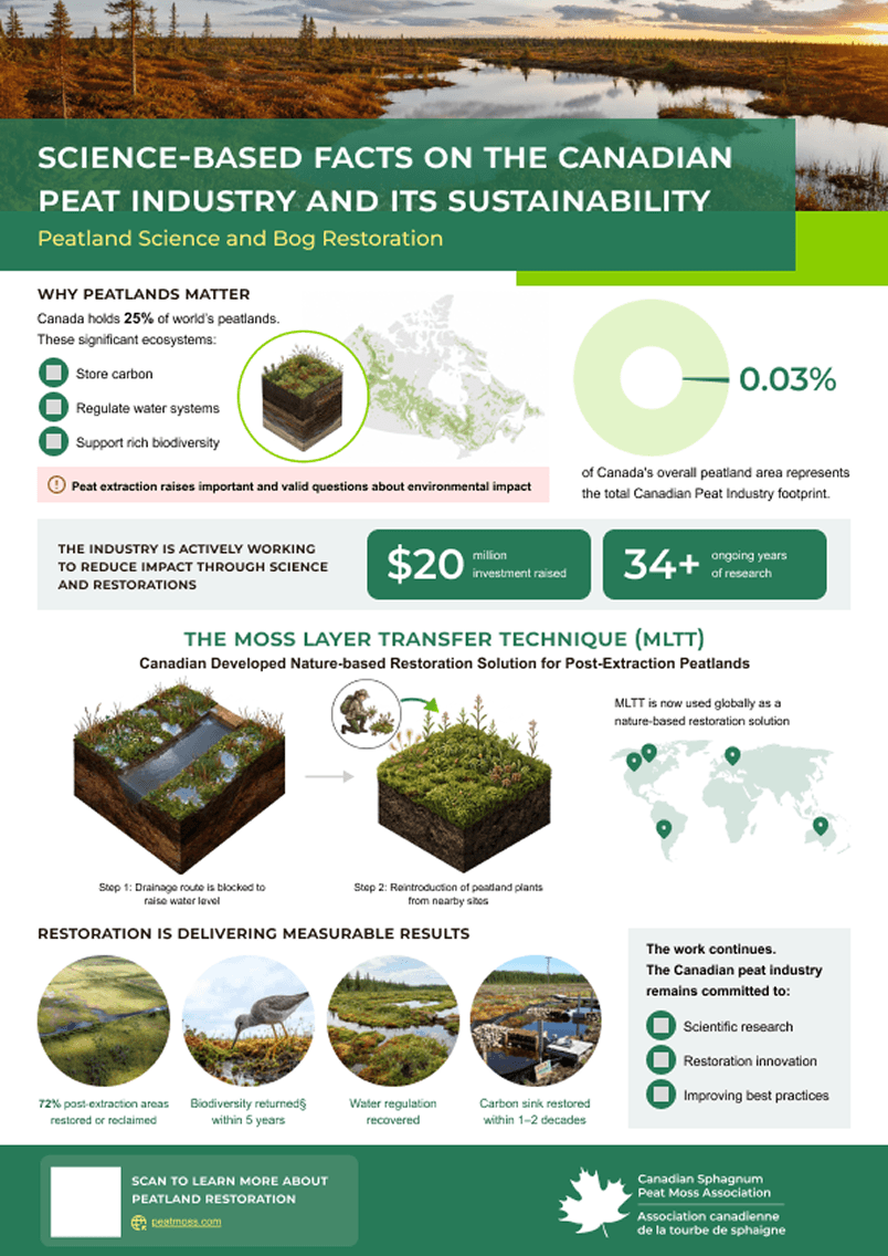
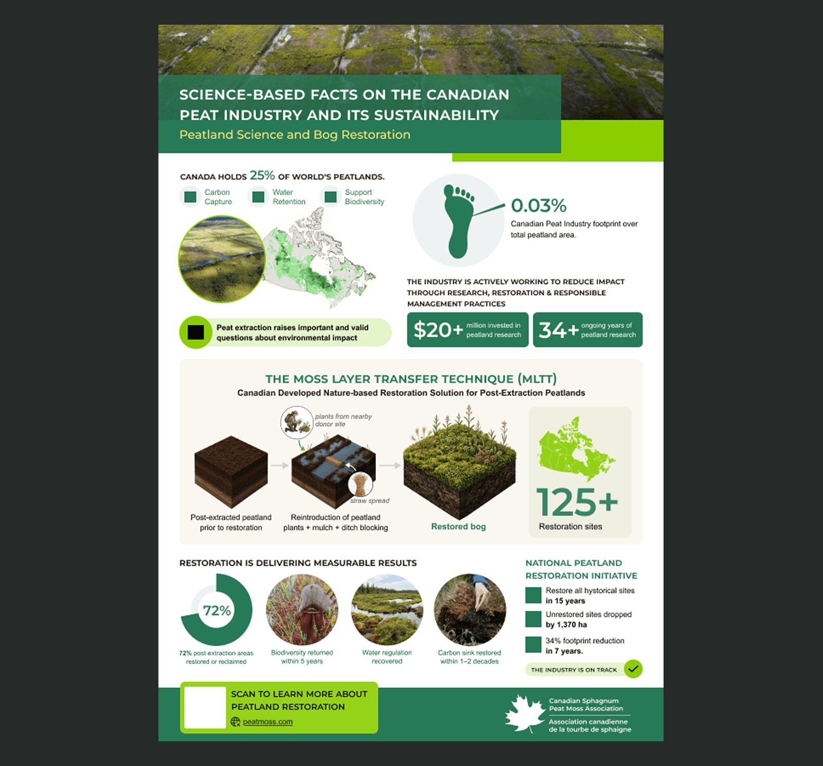
The Following design is Version1.
Generating Diagrams:
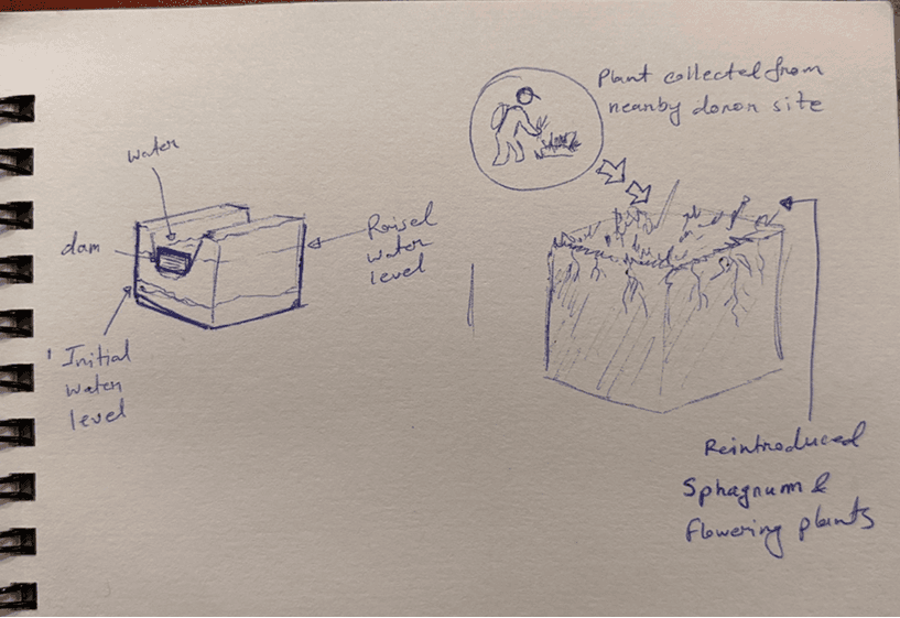
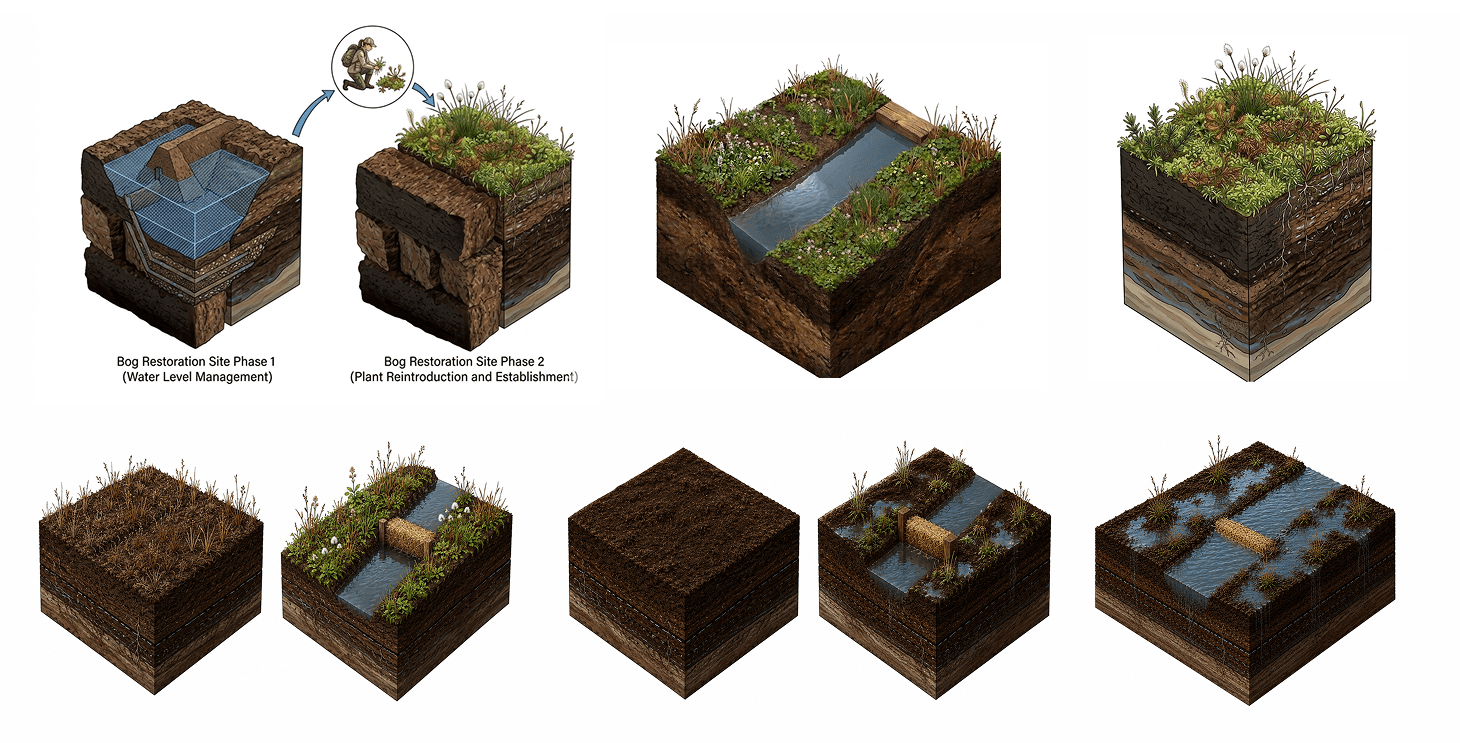
The standout section of this infographic is the MLTT process, and getting the right diagram for it was the most hands-on part of the project. I started with a hand-sketched diagram and generated multiple versions, refining the prompts each time based on what was and was not working, adjusting complexity, layout, and visual style until the output matched both the content and the overall design. It was an iterative and genuinely enjoyable process.
Hand Sketch for reference
AI generated diagrams and refinements
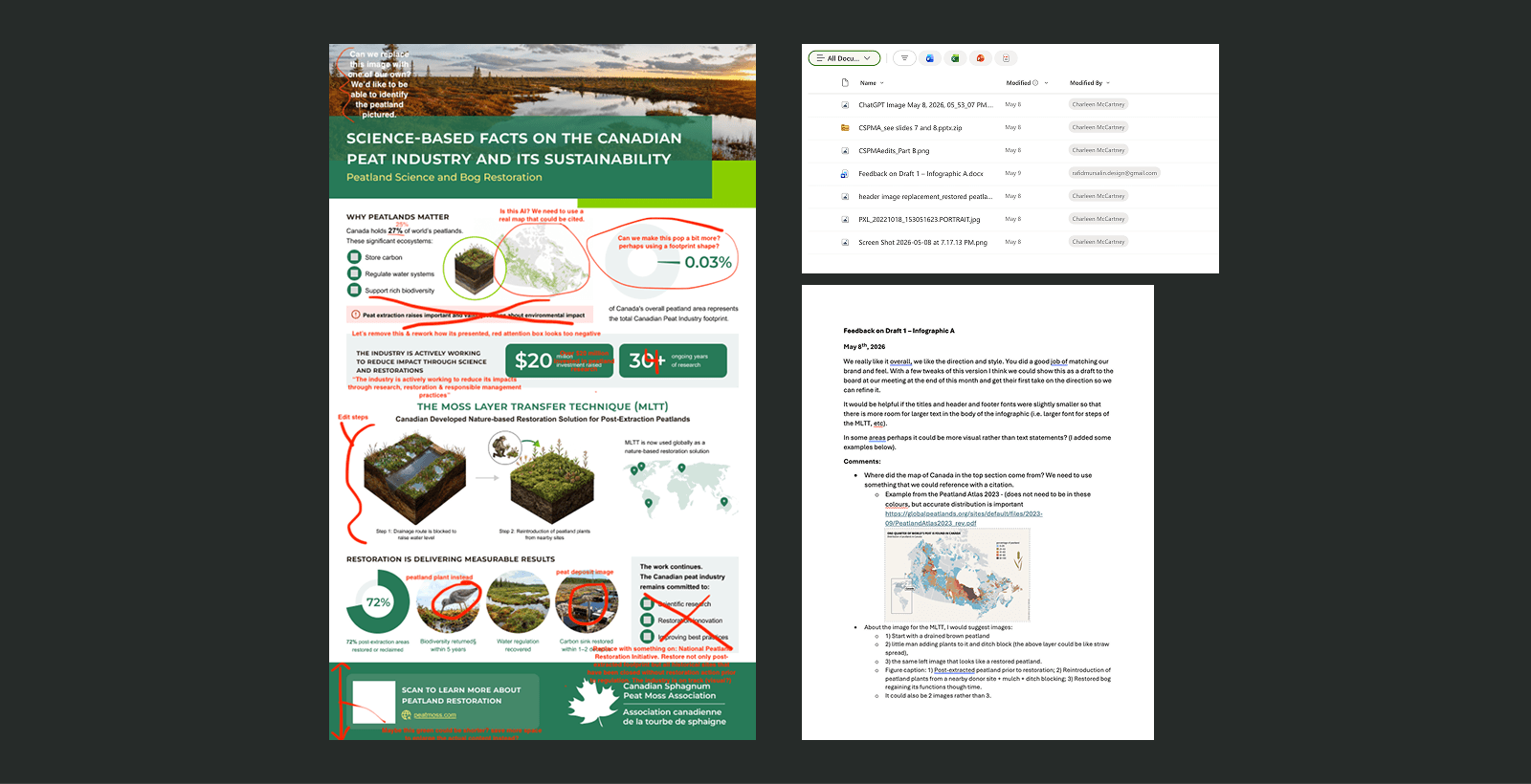
Review & Refinement
After completing the first version, I sent it out for client review. The feedback was specific and constructive, covering layout adjustments, content hierarchy, and detail-level changes.
Feedback
Iteration
This is an ongoing project, additional information will be added as they become available.

